Country comparisons of COVID-19
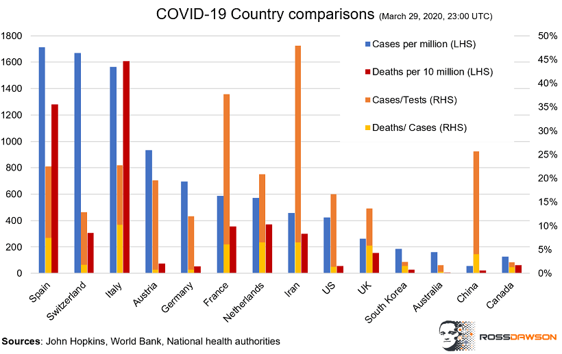
While there are plenty of excellent data sources and visualizations of the state of the COVID-19 pandemic globally, I haven’t seen ones that provide the comparisons that I’m looking for, so I created this chart:

It is important to note is that data on the number of tests taken is not always up to date and is not consistently reported, but other than for China and Iran is likely to be reasonably accurate. I didn’t include Belgium in this chart as there is no recent data on the number of tests taken.
The deaths are represented as per 10 million population and the cases as per million population so they are visually comparable on a chart, though this means you need to mentally adjust for the factor of 10. It does however show, for example, that there is more than one death per 10 cases in Italy.
Exploring the differences
One striking feature is that Germany, Austria, and to a degree Switzerland, have far lower deaths per cases than other European countries. While they have very good health systems, arguably those of France and Italy, for example, are also good.
I looked at the proportion of the populations that are over 65 to see if the southern European nations have substantially older populations. Italy has the oldest age profile of these nations, with 23% over 65, but it is 20% for Germany and 19% for Switzerland, so not dramatically different.
Another major variable is how long the pandemic has been spreading. I haven’t tried to fit that onto this chart, but you can see the dates when 100 cases were reported below:
Spain – March 3
Switzerland – March 7
Italy – February 24
Austria – March 9
Germany – March 1
France – March 1
Netherlands – March 7
Iran – February 27
US – March 3
UK – March 6
South Korea – February 21
Australia – March 10
China – January 19
Canada – March 12
France and Germany reached 100 cases on the same date, so while Italy started substantially ahead of other countries, Spain and Netherlands, for example, have come from behind.
Proportions of tests, cases, and deaths
The cases per test and deaths per case are instructive. Where cases per test are high there could be insufficient testing and thus under-reporting of cases, as in Iran and China, however it is highly concerning that this is very high for France.
Deaths per cases are of course lower where the infection has spread more recently, such as the US.
What will be interesting is to track the development of these trajectories moving forward.
There are probably better ways to visualize this data, any suggestions welcome, and please add any comments on what may be driving the differences between countries here or on social media.


